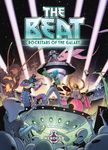


Hello everyone, I’m Daniel Caballero, illustrator of The Beat: Rockstars of the Galaxy, a game by Morten Blaabjerg and Christian Kudahl that will be published this year 2026 by Nerdlab Games.
After working on a few illustrations for Final Titan and its expansions, another game that Nerdlab released this year (by Richard Garfield and Christian Kudahl), Dominik Lorenz thought I would be a good fit for one of the projects that was still in the early stages of development. That project was “The Beat: Rockstars of the Galaxy”, a cooperative limited-communication and hand-management game for 2-4 players where you play as an up-and-coming alien band and tour the most legendary venues in the galaxy.
He was very insistent that I should like the project and find it appealing before giving the yes, and I was like: “Aliens and rock? Creative freedom? YES, OF COURSE, Dominik!”
REFERENCES
Many of the references we drew on for “The Beat” were elements that had already been part of my childhood and adolescence, and to which, to a greater or lesser extent, I feel a certain attachment and inspiration, so the whole process felt quite natural and organic to me.
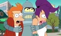
Futurama: By Matt Groening. I always liked it better than The Simpsons, and in this case, it was a great example of how we could blend the pop culture of the time with science fiction, aliens, and social satire. Colorful and funny, that’s it.
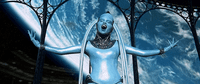
The Fifth Element: Directed by Luc Besson. One of my favorite movies from my childhood. It strikes the perfect balance between serious and fun, and its pop retro-futurism was key, thanks to the constant contrasts in clothing, aliens, and settings. Special mention goes to Diva Plavalaguna and her entire scene.
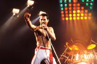
Rock bands, album covers, clothing, instruments, and music videos (from the ’70s to the ’90s). It was a pleasure to put together a playlist specifically for this project.
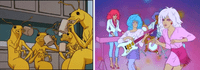
Animated series from the ’80s and ’90s, such as Men in Black and Jem and the Holograms
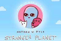
Strange Planet: by the comic artist Nathan W. Pyle . I think this was key for the grey men fans. But this gray men was quite more enthusiastic and less rational in imitating humans.
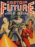
Pulp sci-fi: Colorful, kitsch, weird and familiar at the same time.
THE BAND MEMBERS
There were many candidates, but the galactic throne of rock isn’t for everyone.
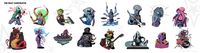
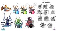
When putting together a memorable band, it was important for each member to fulfill their role not only musically, but also in terms of personality and style. And, of course, for them to be conveniently and strikingly distributed across the color wheel. It should be easy to distinguish them just by the silhouettes of their heads. We ended up with a lot of options, so it was really tricky decision to make the final call.
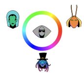
An example of character heads positioned along a color wheel to test head shape and color distribution
THE SINGER
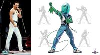
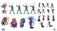
As you’ll see with the rest of the band members, the inspiration is pretty obvious. In this case, Freddie Mercury. The band’s frontman, exuding confidence and power in every sense, but with his head stuck in a fishbowl to give him a certain vulnerability and exoticism. Trivia: The eight lights on his forehead represent the eight notes within an octave.
THE GUITARRIST
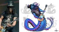
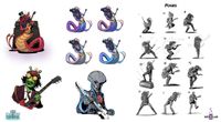
Yep, it’s Slash. I wanted him to come across as a big, laid-back guy who truly enjoys what he does, in contrast to the hard sound of his guitar. So we made him a big, feeling-good slug. His color palette helps give the band a psychedelic vibe. Trivia: The energy that powers his guitar comes directly from his own energy that generates his bioluminescence
THE KEYBOARD
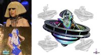
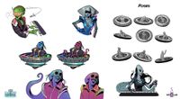
Lady Gaga as reference was a good choice. Her futuristic pop “Poker Face” outfit fit perfectly with the influence of “The Fifth Element”. She adds variety to the group, and the “Gaga-bot” look is a nice touch of pulp sci-fi. Trivia: Her circular keyboard (pianoarc) is part of her body. Before going on stage, she removes her legs and climbs into her musical flying saucer.
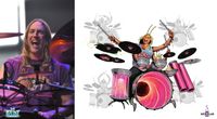
THE DURMMER
In this case, the inspiration was Danny Carey, Tool’s drummer. Dominik, Max, and I are all Tool fans, so it was a unanimous decision. And I have to say that I’ve heard the comment that Danny must be an alien on several occasions. This one is energetic, fun, and wild, but extremely dedicated to his music. Trivia: You can find the alien he’s in love with on one of the game cards.
EVENT CARDS
I decided to expand on the universe a bit through the art of the cards, using what could be called “narrative.” In the galaxy, each species has carved out its own specific niche, and the gray men are the primary consumers. A homogeneous mass of fervent fans that grows larger and larger every day, thirsty for music and merchandise. The rest, as can be seen in the cards, have gradually adapted to this overwhelming majority in order to profit from them as much as possible.
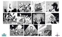
I went all out with the silly comic book style for the cards. The event cards would be kind of monochromatic so they wouldn’t stand out from the rest and to make the image easier to read. Drawing explosions, abductions, electrocutions, indigestions, fights, and so on made this phase of the project especially funny.
VENUE CARDS
I maintained the comic-book style with the “noise” effect for the events, and used festival poster designs, well-known venues, and typical spots like pubs, nightclubs, and trucker restaurants as references.
I tried to ensure that the visual narrative of the venues (when viewed in order) would, to a greater or lesser extent, depict the band’s path to stardom. When they start out at their first venues, the camera is very close to the venue or even inside it; we can sometimes see the audience up close, and most of the doors are closed, reinforcing the sense that every show and every fan counts and that the early days are tough.
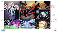
As we move on to the most challenging venues, the doors open, the camera pulls back, and the fans become a sea of greys, or we simply see the festival posters, making us feel like just another group now fighting to be the headliners.
BOX COVER
The box cover was meant to show the band trying to play a song while surrounded, as a sort of cameo, by all the chaos caused by the event cards throughout a concert, thus depicting what a typical concert day for The Beat might look like.
It was meant to convey rhythm, teamwork, chaos, party, music, and fun.
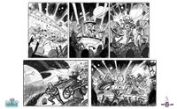
The composition had to be carefully controlled in order to fit all the elements, including the participants, the events, and the title, and to guide the viewer’s gaze appropriately through various focal points without creating noise or information overload despite the chaos.
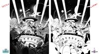
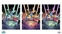
I had to keep the comic book style, but they wanted it to look a little more polished, so I was able to spend some extra time on the finishing touches.
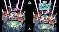
I thought it would be fitting to recreate the feel of a televised concert like a cartoon series, so one of the key elements was adding a subtle chromatic aberration and noise typical of an old TV. And that’s pretty much it!
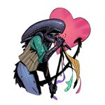
I had a blast working on this game, It was good for me to loosen up and return to a less technical demanding and more creative, fun, and expressive art form. Apart from a few small and insignificant unforeseen events, everything was smooth, chill and easy, something as a freelance I really appreciate. Thanks Nerdlab for their trust!
Thanks for reading and hope you enjoy The Beat!
Tell us how can we improve this post?