I’ve always been drawn to collaborative games with asymmetrical information. I like designs with few rules, high replayability, and systems that rely on player perception from different points of view. Cards often fit this approach well, especially when paired with a simple yet rich communication system.
One day, I started thinking about a different way to mark clues—something that could be fully integrated into the system, without adding extra components or rules overhead. What could work through a simple, intuitive gesture we all know? Clipping. The act of taking a clothespin and adding it to a card was instant love. That is were the journey of Clips started.
The Base Flow
The core idea of the game was quite clear: a collaborative card game where players could not see their own cards, could give and receive hints from the other players using the clothespins, and must play a card on each turn.
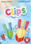
Clipping immediately showed several key advantages. It allows players to add and remove information quickly. Clothespins can be read from both sides, as they are usually symmetrical, and they carry only a limited amount of information. Each one can be slightly different from the others, while still remaining simple. Their number is also naturally limited, creating a shared pool.
From a design perspective, this opened up new possibilities. Each clothespin could convey only partial information about a card. The pool could be shared, forcing players to manage it collectively. And some actions could generate information simply because a player chose that move over another. The clipping gesture could be not only a gimmick, but shape the game itself.
Information
The first question was what kind of information the cards should provide. I wanted the information to stay simple. In this kind of system, complexity doesn’t come from the elements themselves, but from how they are combined and interpreted. Colors, symbols, and numbers are usually the most direct way to achieve this.
However, I was looking for something slightly different. I wanted something that could naturally interact with the idea of clipping, and that would allow players to give and receive hints easily, but without being certain about their cards. I wanted to keep the tension when a player plays a card, until they are able to see if the move is good or not. The first solution I explored was bicolor cards.
With bicolor cards, the information could remain deliberately fuzzy. Even if you know that a card is red, you don’t know whether it is red/yellow, red/blue, or red/green. Players can narrow down possibilities without ever fully collapsing them into certainty. Numbers, on the other hand, were useful to keep the gameplay working and to create different goals, such as same color pairs, or same numbers. Simple yet efficient ideas on which to build a feeling of progress.
The Theme and the First Reactions
The first idea for the theme came quite naturally. Vertical cards on which you clip colored clothespins = tissues. What else? It matched well, it was intuitive. Tissues can represent many things, and this was something we spent time exploring together with the publisher.
But it was clear the game was about the “Clips”, not the cards. We started testing the game everywhere we went: bars, pubs, sometimes even at the beach. Something unexpected started to happen. People would stop, watch us play, hesitate for a long time and then finally come over to ask what we were doing. They couldn’t resist any longer. In Italy, playing cards in bars is extremely common, especially traditional card games. But no one had ever seen colored clothespins clipped onto cards. The game was visually distinctive, tactile, and inviting. Those moments were just great.
The Quest For Elegance
At that point, the game started to work, but the material still felt like too much. I began questioning what could be removed and what the core experience really was. Was having two separate categories of information actually necessary?
We applied the Six Thinking Hats many times.
Colors turned out to be the key element of the game: the color of the tissues, and the color of the clips. But how could numbers be expressed using only colors?
I forced myself to remove the numbers and try a different approach: one clip for one, two clips for two, and so on. The theme helped justify this naturally. If a tissue is small, one pin is enough. If it’s larger, you need more pins to keep it safe from the wind. And I could add an interesting twist. If a card has three pins on it, it clearly cannot be a one or a two, but it could still be a three, four, or five. This way, information remains partial and deliberately fuzzy.
Presenting Clips to Piatnik
The first presentation to Piatnik was a key moment. Florian and I always had a very good connection on game styles, since the publishing of 80 Days. The potential of the game was immediately clear.
The gesture of clipping did most of the work. The discussion quickly moved away from rules and focused instead on player experience: what it feels like to place a clip, when you hesitate to move one, and how much information you are willing to commit in front of the group.
It took only a few weeks for the publisher to decide: even if producing clothespins is quite unusual to a board game publisher, they accepted the challenge.
Building the Levels
Building the different levels of the game became a key part of development, and it was something I worked on closely with the publisher. The challenge was finding the right balance between making the game immediately accessible, for demos and first plays, while keeping it intriguing for players who would come back to it multiple times.
After well over a thousand games with my most dedicated playtesters, Stefania and Marco, I had a very clear understanding of the harder levels and of what keeps the game interesting even after repeated plays. We had some “special levels” that we loved to try and defeat.
But that also came with a risk: losing touch with the experience of someone discovering the game for the first time. This is where the publisher’s contribution became crucial. Bringing a fresh perspective, and a strong sense of how games are taught, shown, and sold, helped rebalance the progression. Together, we reviewed the structure of the levels, adjusted their pacing, and reconsidered elements such as the optimal number of cards in the deck for printing reasons.
In the end, we arrived at a more gradual and readable progression. Those phases of tuning and revision are exactly where having the publisher fully involved makes the difference.
Discussing the Theme
The theme remained a recurring topic throughout development. Tissues could represent many things, and that flexibility was both a strength and a question mark. We discussed how much the theme should guide interpretation, and how much should be left abstract.
Several alternatives were explored and tested:
Morocolors – the first theme, where players are dyers in Morocco trying to deliver the best tissues to special customers from all around the world. Exotic, but straight to the point.
Gnomes stealing socks – cards represented socks, while clips marked which one to steal for the gnomes village hidden in the walls of the house. The idea played with disappearance, and fit naturally with color-based clues. Plus colored socks are visually appealing.
Naughty sheep falling into color cans – sheep fell into different colored paint, and they needed to get dried on the right thread. Funny, but could have been read as not animal friendly.
Actors having to change in the dark backstage – cards represented clothes, and clips tracked fast costume changes. All happening in the dark backstage.
Tuscan flag throwers – cards showed flags, and clips marked suggestions on which flag to throw next during performances. An Italian, culturally-grounded setting.
In the end, we decided to keep the theme simple and direct: tissues. They are immediately readable, physically coherent with the gesture of clipping, and flexible enough to support the system without explaining it. For the same reason, the title became obvious. Clips describes both the main component and the central action at the table.
Conclusion
Looking back, the project stayed remarkably close to its initial question. How little is needed to create a meaningful asymmetrical information game that can scale from family to expert? In Clips, the answer is a gesture full of colorful unique tokens. A small physical action allows players to create their communication system and improve game after game.
Now it’s time to put the game on the table and see how players feel about it.
Link to the game: Clips by Emanuele Briano

/pic9326504.jpg)
/pic9386860.png)
/pic9386861.png)
/pic9386863.png)
/pic9326503.png)


